




The short answer
Match a shirt, tie and pocket square by picking one dominant colour to repeat, varying pattern scale between the three pieces, and never matching the pocket square to the tie exactly. In Bangkok's tropical light and mostly indoor, air-conditioned business settings, this approach reads as considered rather than costumed, whether the suit is navy for the office or a lighter fabric for an evening event. Manchester Tailor BKK's stylists in Khaosan Area can walk through combinations against your actual suit fabric during a fitting.
Start With the Suit, Not the Tie
The most common mistake in shirt-and-tie matching is starting in the wrong place. The suit is the largest surface and the fixed point of the outfit, so it should dictate the palette before you even open a tie drawer. A navy suit gives you the widest playing field — white, blue, pink and lavender shirts all work, and ties can range from burgundy to forest green to navy-on-navy texture. A charcoal suit is cooler and more formal, and looks best with white or pale blue shirts and ties in burgundy, navy or silver rather than warm browns.
Once the suit is fixed, treat the shirt as the second decision and the tie as the third. This order matters because it keeps the outfit anchored: if you choose the tie first, you can end up building a shirt and suit around it, which usually looks try-hard. Working suit, then shirt, then tie, then pocket square keeps every layer answering to the one before it, which is exactly how a tailor thinks about an outfit as a whole rather than as separate purchases.
The One-Colour Rule
A reliable working method is to pick one colour and let it repeat, in different shades or textures, across two of the three elements — shirt, tie and pocket square — while the third element breaks the pattern. For example, a white shirt, a burgundy tie, and a pocket square that picks out a secondary burgundy thread from the tie's weave, rather than matching it stitch for stitch. This gives cohesion without looking like a matched set bought off a mannequin, which is the effect most men are unconsciously trying to avoid.
Avoid matching the tie and pocket square in the same fabric and colour exactly — it is the single fastest way to look overdressed for anything short of a very formal event. The safer move is a pocket square that relates to the tie in colour family but differs in pattern or material: a solid linen square with a printed silk tie, or a subtly patterned square against a plain knit tie.
Pattern Scale: The Rule Most Men Get Wrong
Pattern mixing fails most often not because of colour clashes but because of pattern-scale clashes — two busy patterns of similar size fighting for attention. The fix is straightforward: if the shirt has a pattern, whether a fine stripe or a small check, the tie should carry a pattern of a noticeably different scale, and the pocket square a third, different scale again. A narrow-striped shirt pairs well with a larger-scale tie pattern such as a wide diagonal repp stripe or a paisley, and a small-fold plain or lightly textured pocket square.
If you are new to pattern mixing, the lowest-risk entry point is a solid shirt with a patterned tie and a solid or lightly textured pocket square — one pattern in the whole outfit, carried by the tie. As confidence builds, two patterns at different scales is comfortably wearable for business; three patterns is where most outfits start to look busy unless the colour palette is very tightly controlled.
Texture and Fabric: The Overlooked Variable
Colour and pattern get most of the attention, but texture does a lot of the quiet work in a well-put-together outfit. A crisp poplin shirt, a silk grenadine tie with visible weave, and a linen pocket square create contrast through material even when the colour palette is restrained to navy and white. This is particularly useful in Bangkok, where lightweight tropical wool and linen suits are common for daily wear, and their looser drape benefits from ties and squares with some textural interest rather than flat, shiny silk that can look slightly cheap against a matte fabric.
Wool or knitted ties are a good option in air-conditioned Bangkok offices, adding texture without extra pattern, and they pair naturally with a linen or cotton pocket square rather than silk, since matte fabrics tend to sit better together than mixing very shiny silk with very matte wool.
Pocket Square Folds and When to Use Them
The fold matters as much as the fabric. A straight, flat fold (the presidential or TV fold) is the most formal and understated, appropriate for business meetings and interviews. A puff fold, where the square is pinched in the centre and pushed into the pocket in loose peaks, is more relaxed and works well for social events, weddings as a guest, or Friday dressing. Elaborate multi-point folds are best saved for black tie or occasions where the outfit is meant to be noticed rather than simply well put together.
As a general habit, match the formality of the fold to the formality of the occasion rather than to the outfit's colours — a beautifully colour-matched square folded too elaborately for a client meeting will read as slightly off no matter how correct the palette is underneath it.
How to Match a Shirt, Tie, and Pocket Square Like a Pro
Put together, the professional method is: choose the suit colour, choose a shirt that either contrasts cleanly (white or pale blue against a dark suit) or matches tonally for a monochrome look, choose a tie that repeats one colour from the shirt or suit at a different pattern scale, and finish with a pocket square that relates to the tie without duplicating it. Check the outfit as a whole in a mirror before leaving, not piece by piece, since colours and patterns that look fine individually can still clash once combined.
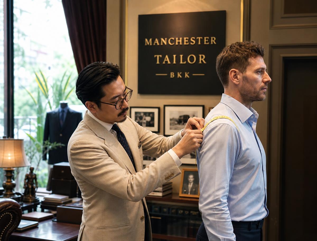
This is also where a fitting appointment earns its keep. Because Manchester Tailor BKK holds a large in-house fabric library and works with clients across multiple visits, our team can hold shirting, tie and pocket square options directly against your actual suit cloth under the showroom's lighting, which is far more reliable than guessing from memory or photos.
Frequently asked questions
- Should a tie always be darker than the shirt?
- Not always, but it is the safest default for business dressing — a tie darker than the shirt keeps the eye moving down the outfit in a natural gradient. Exceptions exist for lighter, textured ties worn with darker shirts in more fashion-forward or evening settings.
- Can the pocket square match the shirt instead of the tie?
- Yes, and it is often a safer choice than matching the tie, since it creates a quieter, more tonal look. A white or pale blue shirt with a pocket square in the same tone, worn under a patterned tie, is a dependable combination.
- Is it acceptable to skip the pocket square entirely?
- Yes — a pocket square is an optional flourish, not a requirement of correct dress. A well-matched shirt and tie alone are complete for most business and formal occasions.
- What is the safest combination for a first-time bespoke suit owner?
- A white shirt, a solid or finely textured navy or burgundy tie, and a white linen pocket square in a flat fold is close to foolproof and works with almost any suit colour.